
Brixtonboogie: Birth of new Band-Brand?
The usual presentation of new Albums or Singles in digital Stores, like the one from iTunes, offers always good opportunities for eye-catching Artworks. A good actual Example is given by the new Album of Brixtonboogie, „Crossing Borders“. Especially inside the Category „R&B/Soul“, where the most Artists are promoted by their Faces, the use of reduced geometric shapes and a clear Black-on-White-Style absorbs the views of the users while browsing through the filled Cover-Mosaics of the Store-Window:
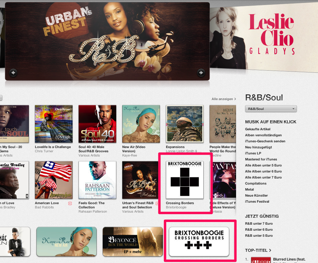
It may surprise, that Brixtonboogie isn’t from London but from Hamburg, Germany. OK, the Bio says, that the Originator of Brixtonboogie, Music-Producer and -Composer Krisz Kreuzer – by the way: „Kreuz“ means in german „Cross“ (!) – often visited the famous London District Brixton and likes the American Boogie, so that’s the roots and the reason for this Band-Name. His Music is described (by himself) as „Urban Blues“. To my ears, it reminds me on what Little Axe has established as well as what The Black Keys are cultivating: modern variations of deep rooted Blues-Forms. I like both and I like „Crossing Borders“, it’s a good piece of soulful music.
Back to the Artwork: The striking black cross, built of five black Squares, works on the Band-Homepage as Main Menu, to navigate trough News, Music, Videos, Photos and Story. That’s cool.
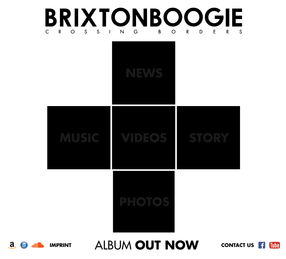
So, corresponding the conceptual title „Crossing Borders“, this Logo visualizes a Cross and also some Borders, if one will see the thin white lines between the squares as such. Much better: The black-white-style goes on in stringent aesthetics of all new Videoclips as Companions of this Album; you should watch them, their really nice filmed:

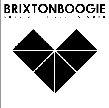
So, the Artwork uses the Symbol as functional Elements, that helps to memorize this Logo inside the Brains of the viewing Listeners. And because of the geometric substance of this Artwork, the Band let the Illustrators juggling a bit with it, for example for the Single-Cover(s):
OK, the question is: will the Black Cross be the „Symbol“ not only for this Album but for the Band itself? Is it becoming a true Pop-Symbol?
Well, it seems like, when the Band uses a lightning object version of it on stage, as seen on their Facebook-Page:


An Indication for taking the „Crossing Border“-Cross as Band-Symbol could be the Favicon of their Website. The cross is strong and recognizable Brand, here:
![]()
If the five square-cross is going t become their Pop-Symbol, they should consider a new Twitter-Acount or a relaunch of the Twitter-Icon from Krisz Kreuzer – especially because the actual Twitter-Icon – an undecodable miniaturization of the first Brixtonboogie-Album-Clover – isn’t looking and working very well, I think:
![]()
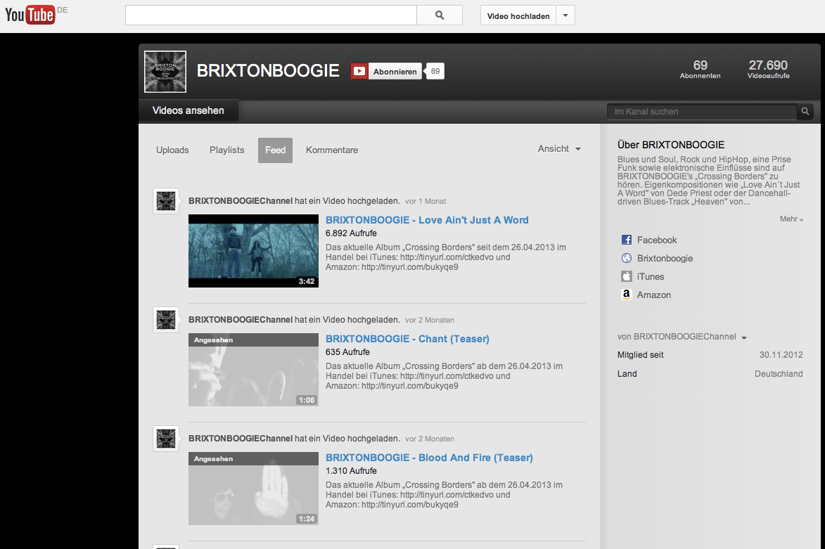
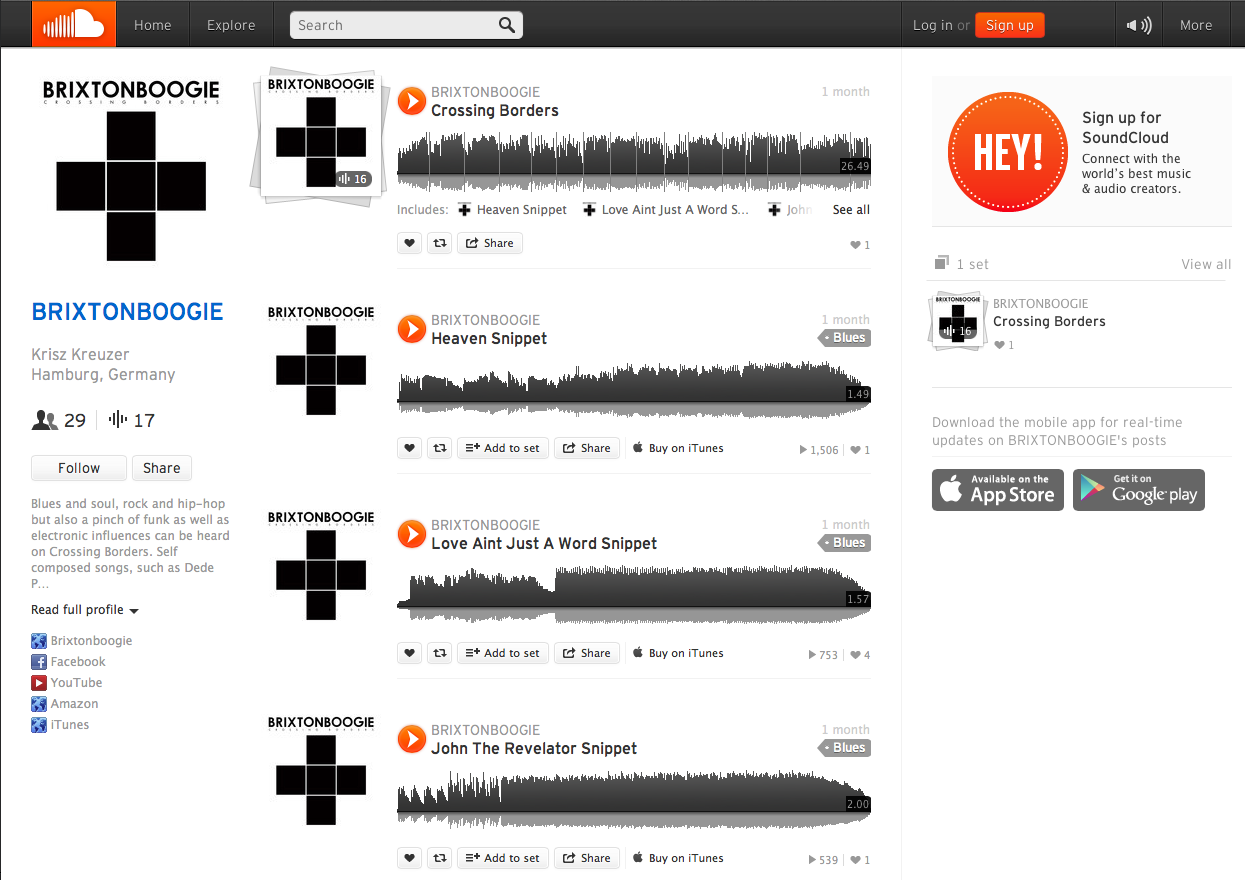
In addition, the actual YouTube-Site of Brixtonboogie (using the Cover Design of a Single) would look better with the Black Cross, as this Comparison with their Soundcloud-Page might show:
As in many cases of a lot of bands before, this beautiful and remarkable Artwork for an Album could be the Birth of new Band-Brand, which becomes a new Pop-Symbol. A Symbol with a touch of a „Classic“, in my point of view, even if it’s an actual creation. I’m curious about the use and the possible evolving of this iconic piece of Visualization. I asked the Band about it (their touring right now). So, stay tuned.